Kavya.
Create personalized itineraries with AI and dive into your destination’s history with captivating audio narratives!

PROBLEM SPACE
Lochist's vision is to make traveling an educational and personalized experience for everyone. Education and planning of the trip are usually the detested aspects of travel. How can we improve the experience in these two arenas?
BUSINESS REQUIREMENT
Develop a Minimum Viable Product (MVP) that transforms travel into a personalized experience while simplifying the entire planning process for all types of travelers.
WHY IS IT A PROBLEM?
Meet Sara, she's planning a trip to New York and these are her concerns.
I am not interested in half of these things-to-do!
So many search results! How do I make an itinerary of my own?
I wish there’s one place where I can plan all of my trip.
I want to experience the place as a local.

An average traveler spends two full work days to plan and book trips says New Priceline Research

SNEAK PEEK INTO THE SOLUTION
IMPACT IN NUMBERS AND RECOGNITION
PEOPLE’S CHOICE AWARD
Honored with People's Choice Award at the IU Capstone Fair!
88.4
System Usability Score
15/15 participants agreed they would use the app frequently and 14/15 participants agreed the app is easy to use.
80%
Perceived adoption rate
Tested the prototype with 15 target users and stakeholders. The app was rated as highly desirable.
HOW DID WE GET HERE? THAT'S ONE HELLA RIDE 🎢
Goal : Understand the business strategy and vision for the product.
Activity: Business Model Canvas with Stakeholders
Result: Offered insights about business strategy, needs and scope that weren't established before the activity.
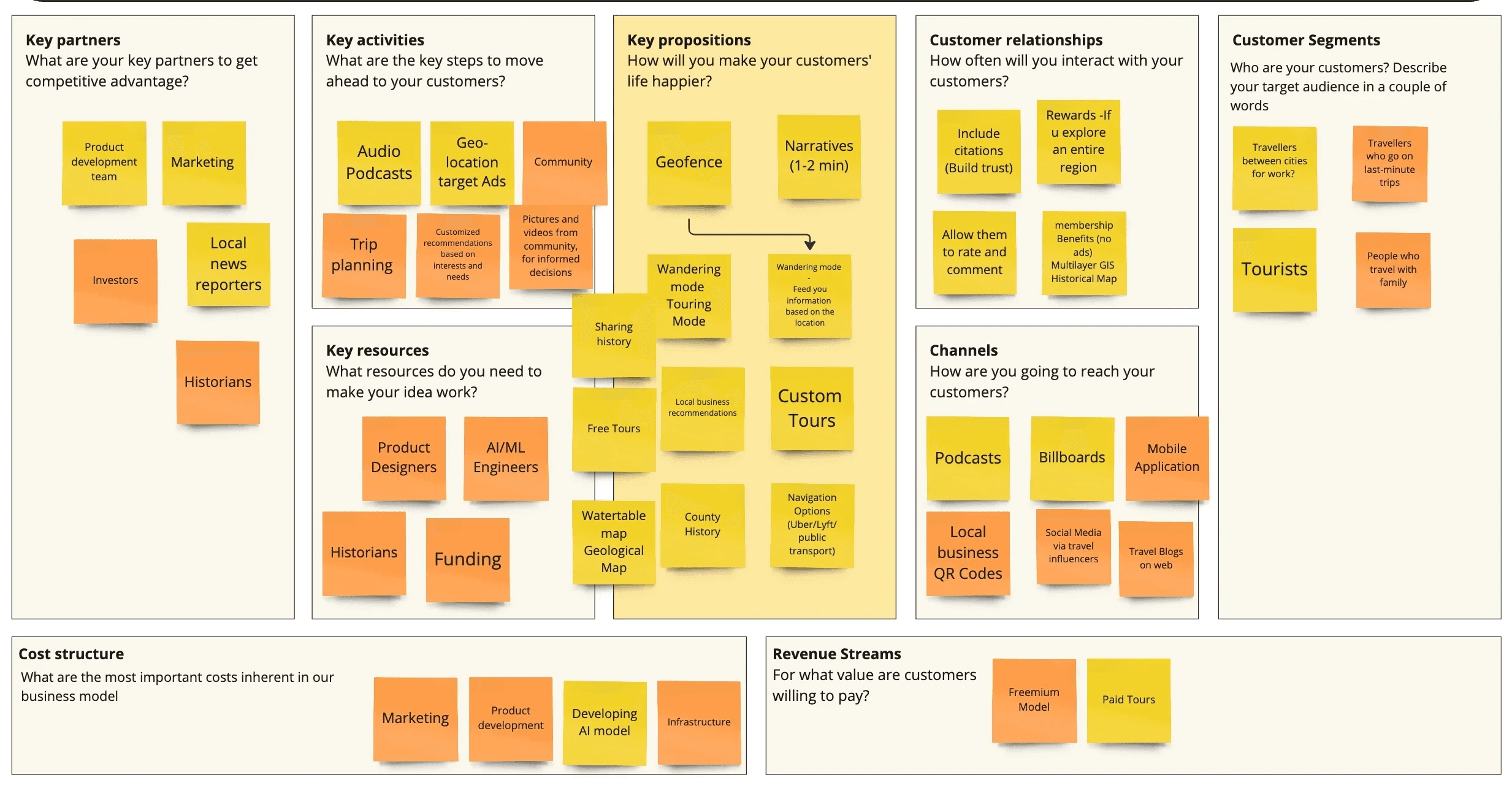
😍
Educational content for the travellers to know more about the location.
📈
Client is keen on using AI and provide personalized experience to the users
🤑
Revenue streams can be through collaboration with local businesses, following a freemium model within the app.
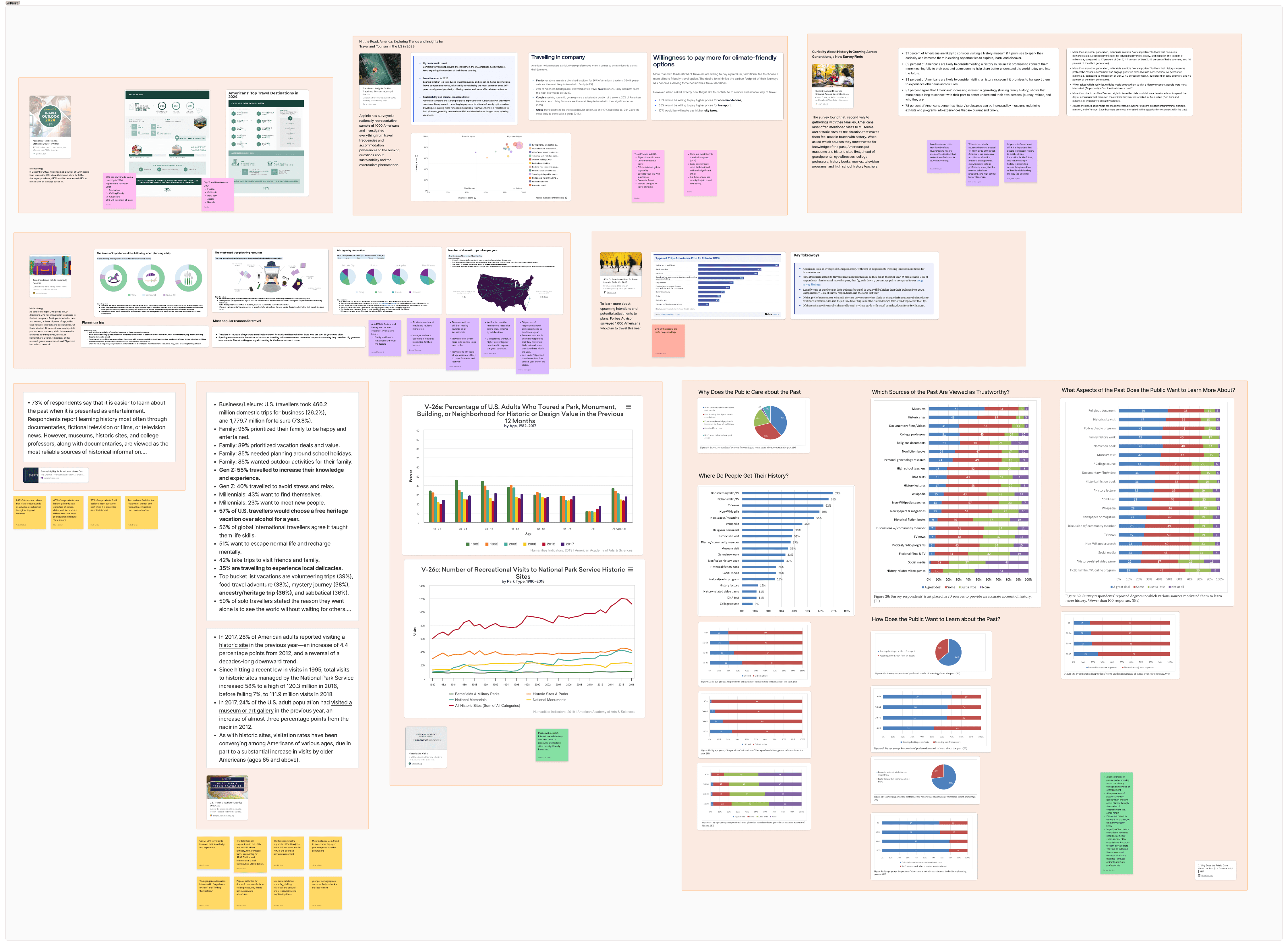
Goal : Understand the market size, trends, and interests on a large scale
Activity: Literature review, competitor analysis
Result: Validated our problem space and understood market gap, trends and travel behavior.
📈
😍
🤑
Goal: Understand user needs, frustrations, travelling style and interests
Activity: Interviews and Survey ( Total size: 30 participants )
Result: Used the insights to build user persona and frame the problem statement.
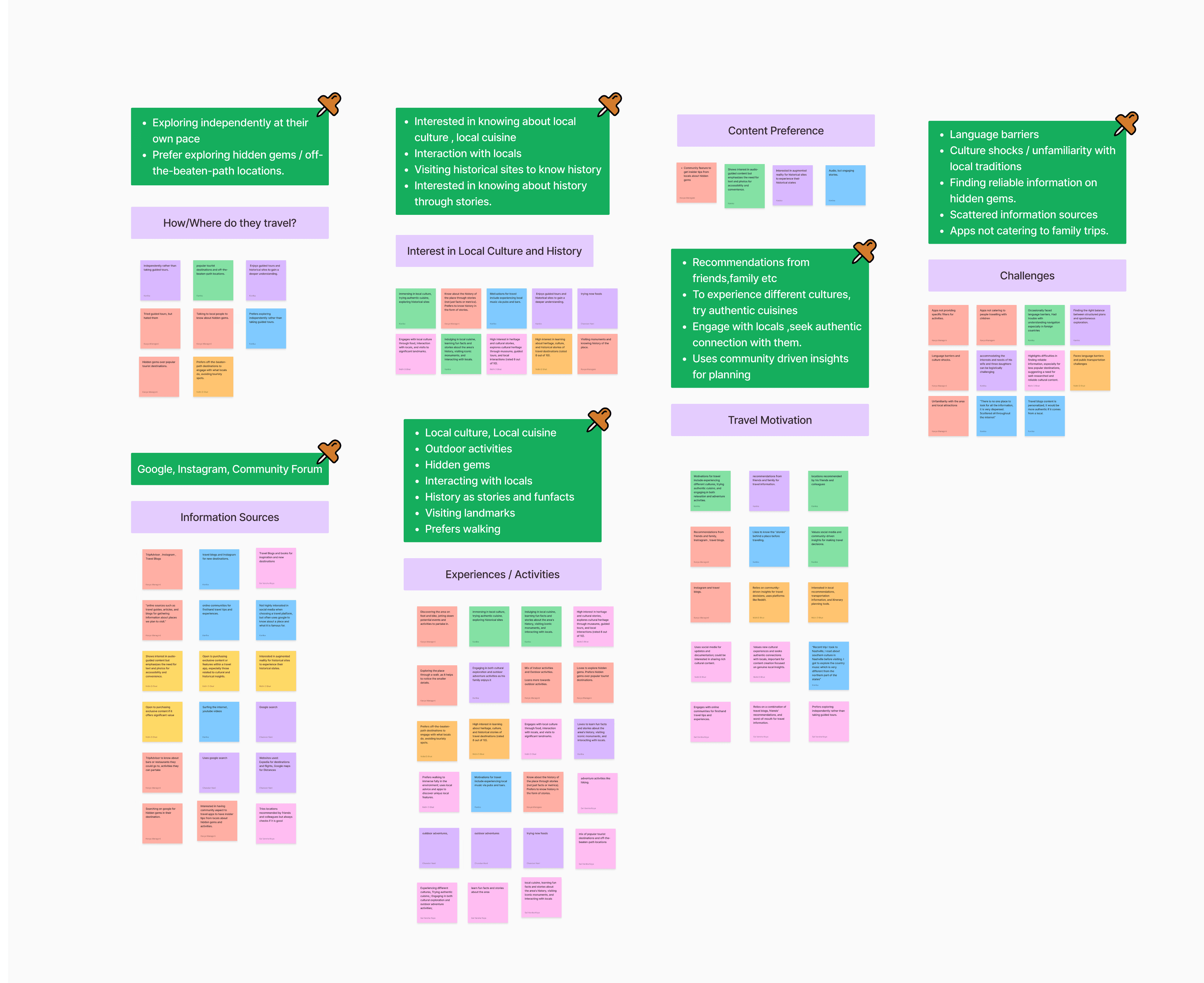
📈
Interested in hidden gems, experiencing local culture and traditions.
😍
Looking for recommendations for local restaurants, local shops
🤑
Learn about history through stories and facts, focusing more on the storytelling
PROBLEM STATEMENT THROUGH OUR USER PERSONA
Meet Laila!
Laila loves discovering new places and learning about different cultures. However, she–
1
Wants a way to explore local culture, traditions and know the history interactively.
2
Finds it hard to use multiple apps for planning and research
3
Struggles to plan trips efficiently and accommodate everyone’s needs.
How might we….
Help Laila discover and explore the destination and it's culture in a way that feels personalized and educational?
USER STORY
As a traveler, when I am traveling,
I want to easily learn about the local culture and plan my route considering key factors like preferences and personal interests (e.g., historical landmarks, cuisine, or outdoor activities),
so I can have a truly authentic travel experience
But currently, I need to rely on multiple websites/apps to learn about the place and build a cohesive itinerary.
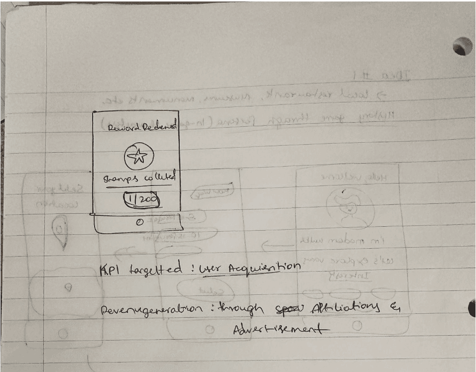
BRAINSTORMING IDEAS USING DISNEY CREATIVE STRATEGY
We came up with 70+ ideas using the Disney Creative Strategy, which we later filtered in each stage based on internal voting, considering user needs, business needs, and focusing on the MVP
In the critique phase, we used sketches to visualize the features and filtered the ideas based on the question, "How can we best answer the user's needs and help them get their job done?"
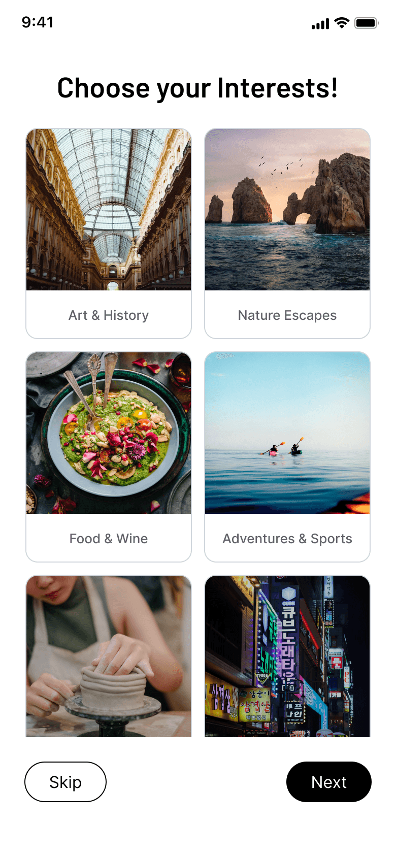
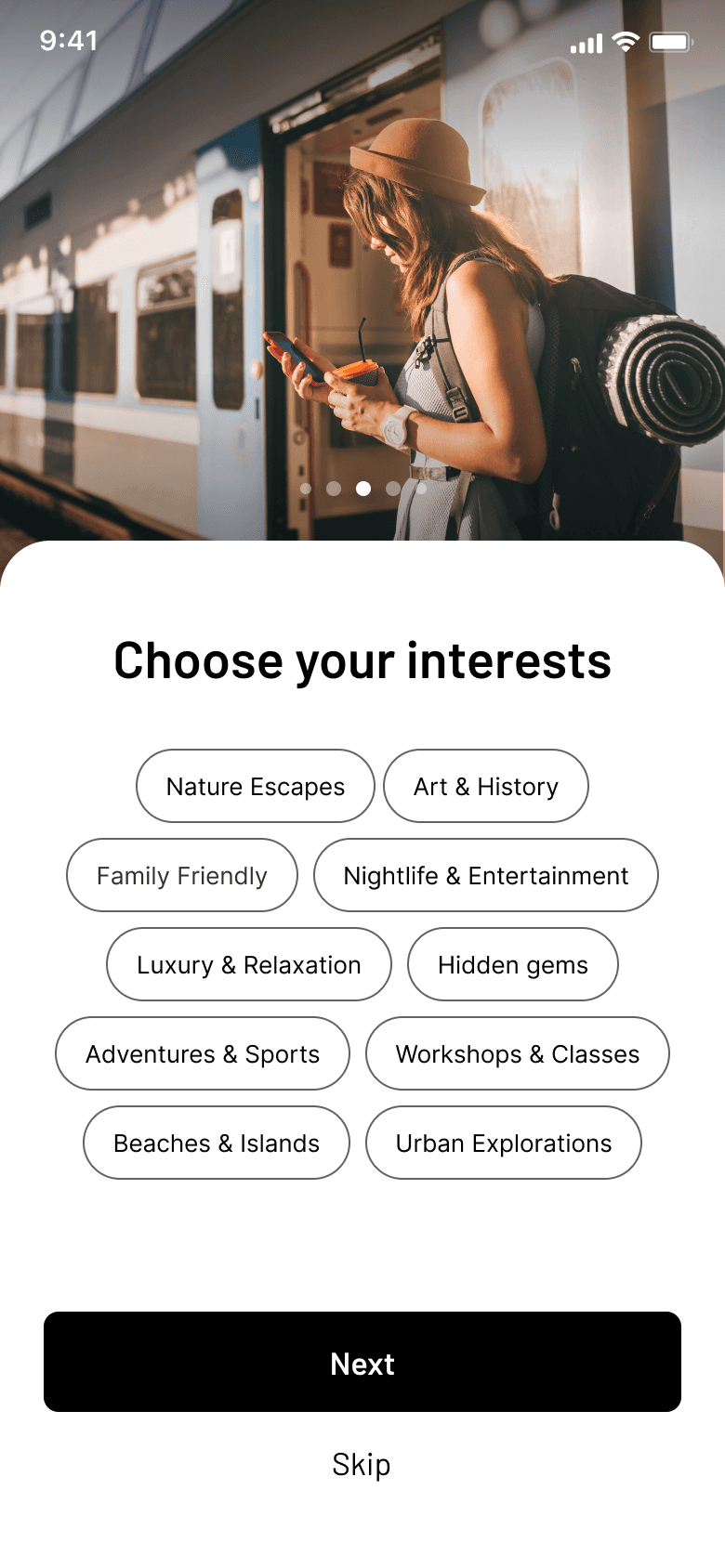
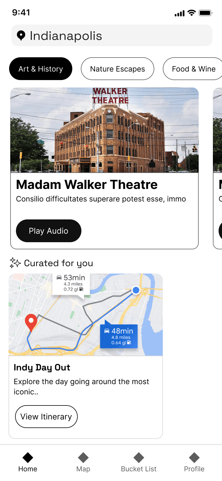
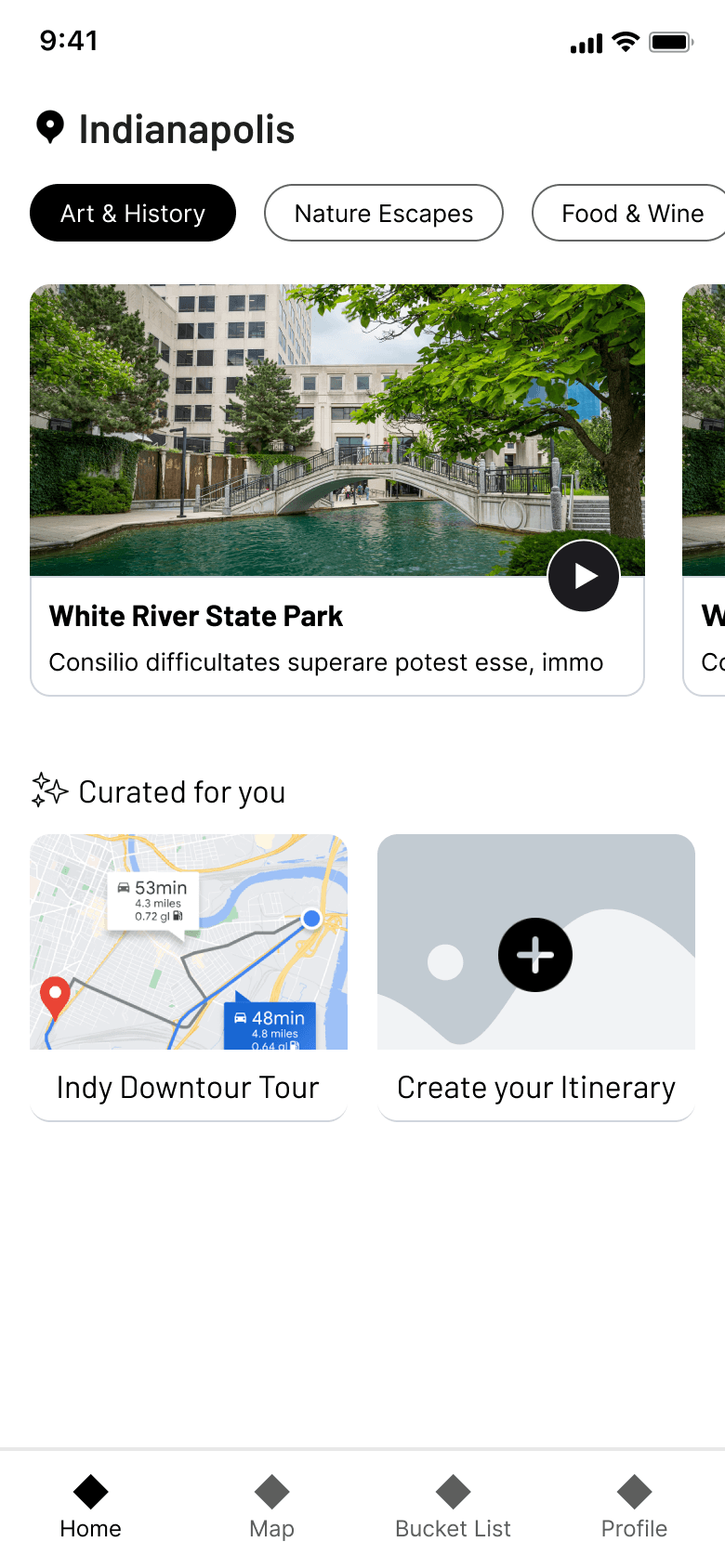
SOLUTION
“A mobile application that takes the user’s preferences and curates personalized itinerary and routes, helping them explore the history and culture of a destination through a tailored list of destinations and activities. The platform also gives an enhanced experience through audio narratives and engaging stories about the place, making the journey both educational and immersive.”
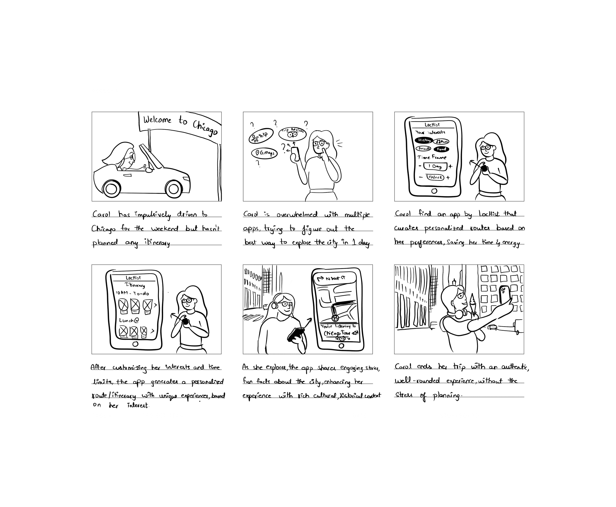
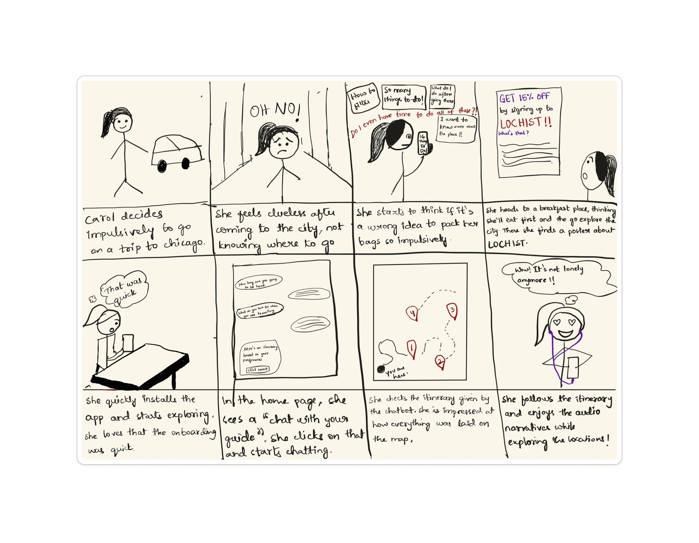
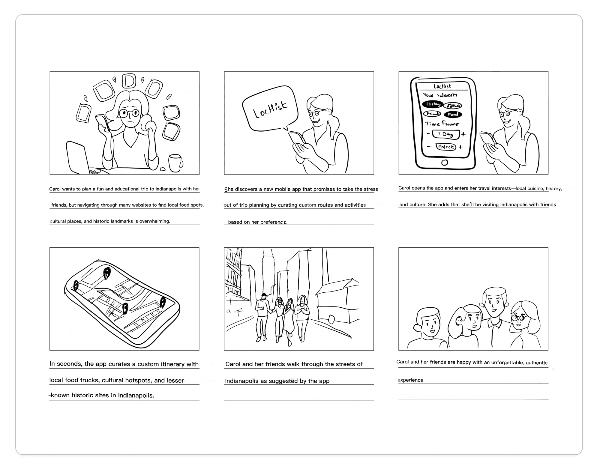
STORYBOARDS FOR VISUALIZATION OF USER BEHAVIOR
We created storyboards depicting both planned and unplanned trips, as well as experiences for solo travelers and group travelers.
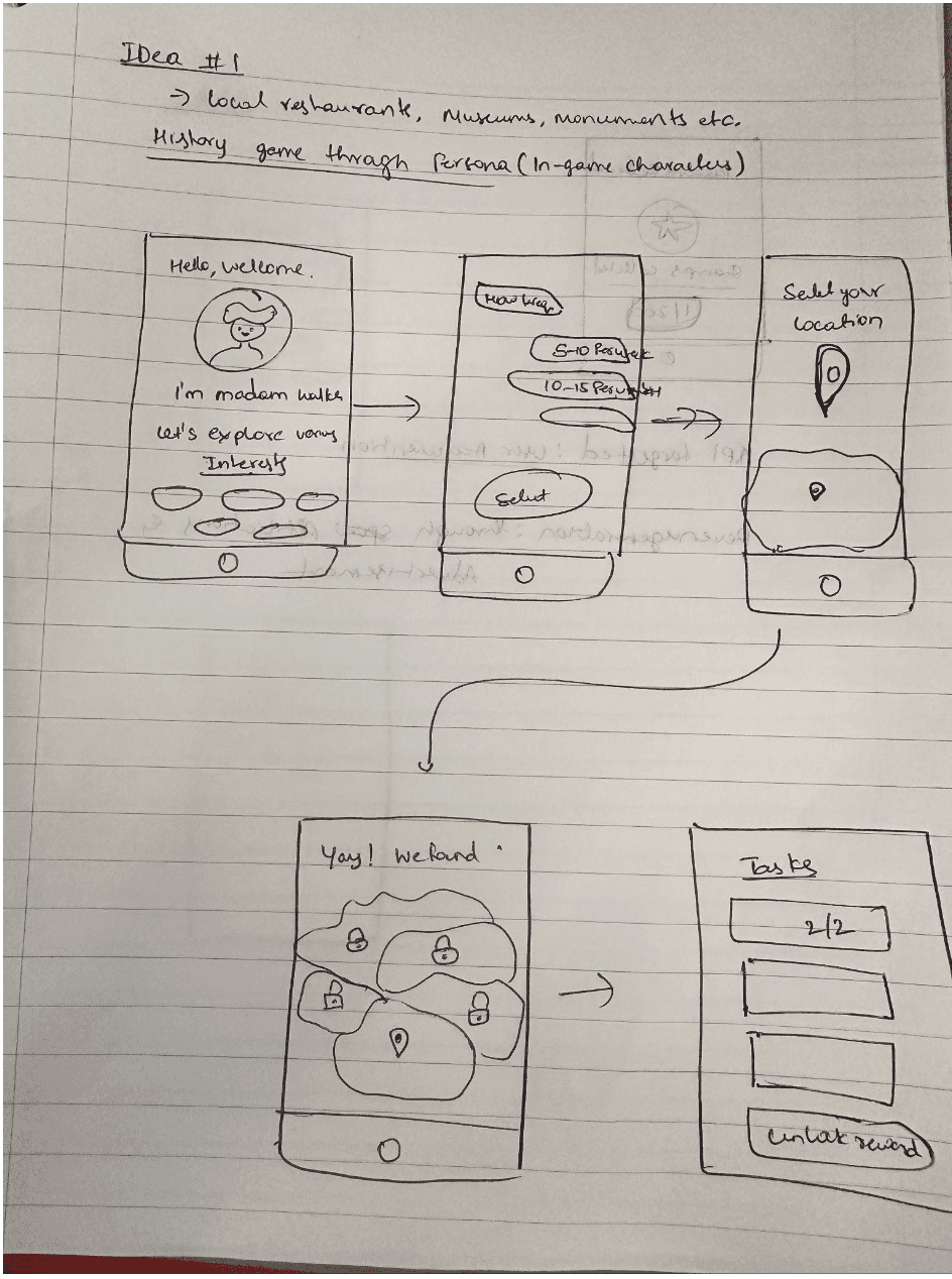
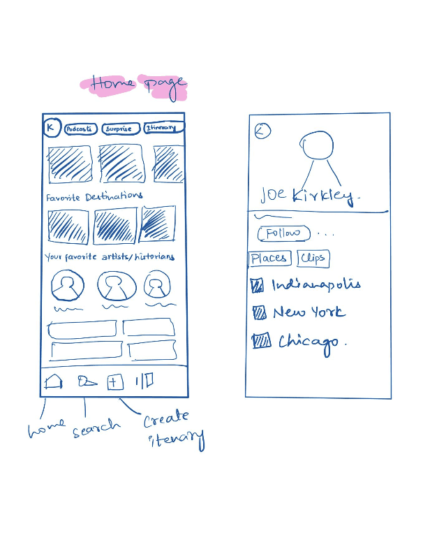
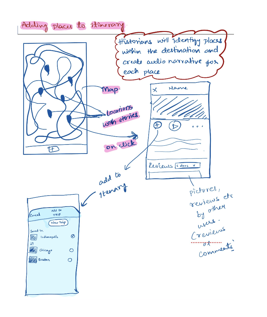
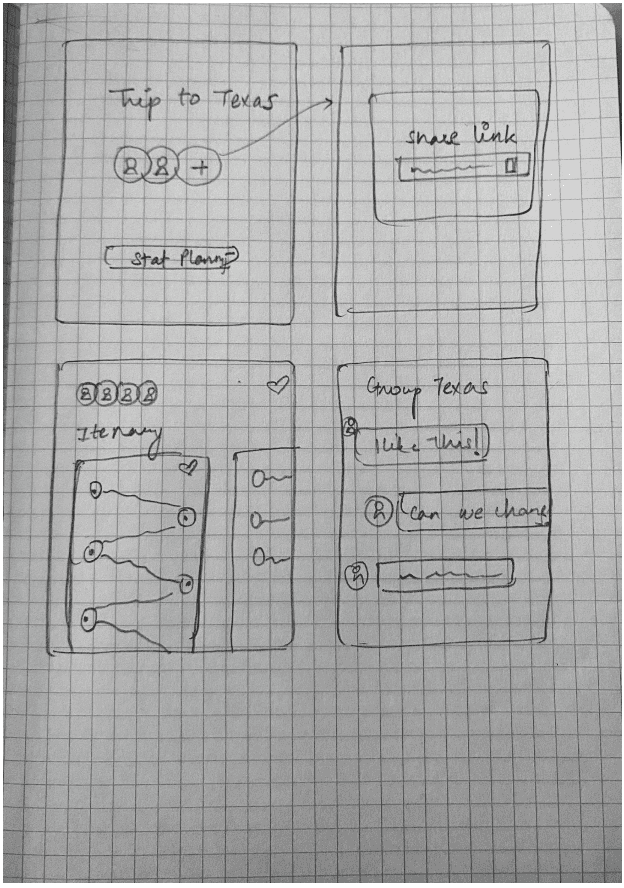
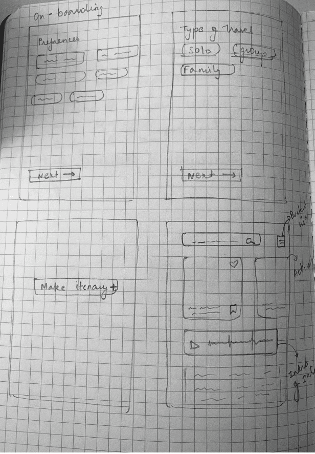
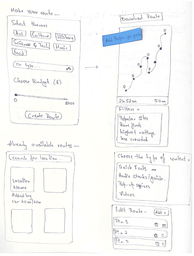
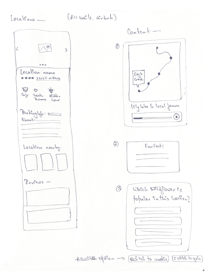
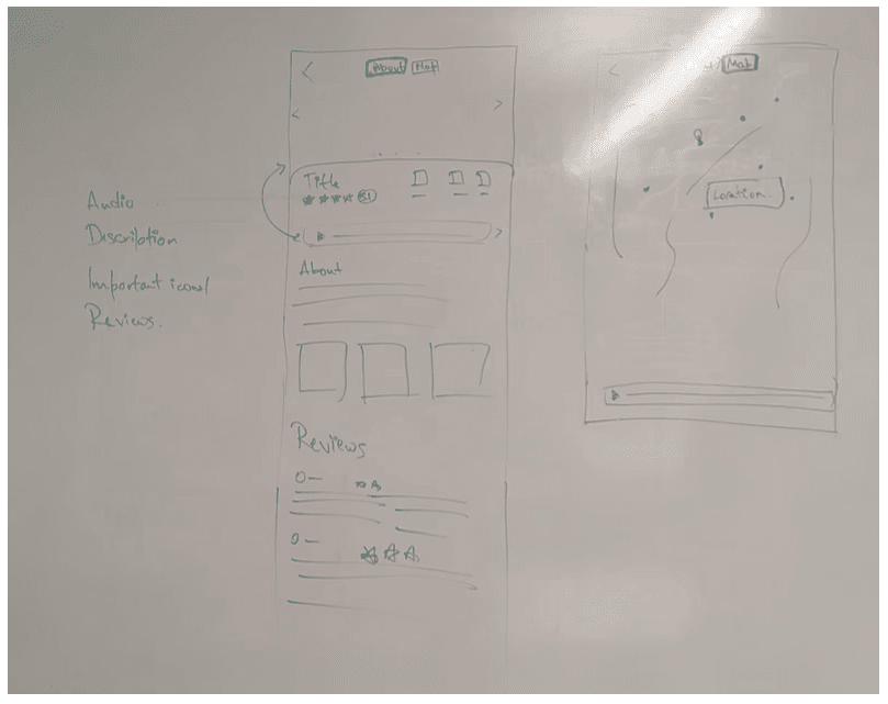
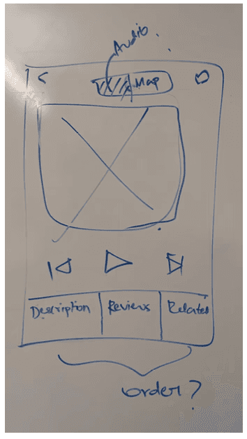
LO-FI USER FLOW & WIREFRAMES
I designed the low-fidelity wireframes based on the information architecture and user flow. I quickly tested the prototype with stakeholders and team for feedback.
CLIENT FEEDBACK TIME!
The client emphasized that the 'learn' feature, which offers content through audio narratives and other formats, should be the top priority. Planning itineraries would take second place and be important.
INTERNAL EVALUATIONS OF LO-FIDELITY WIREFRAMES
Major Feedback:
"Learn" section felt unintuitive, redundant and disconnected from the app’s core purpose. Since the app already provides educational content through audio narratives, reviews, descriptions, and images, we determined removing the "Learn" section would be more cohesive. Instead, we planned to enhance the search functionality, allowing users to discover and learn about locations more intuitively.
ITERATION - WE HIT THE DRAWING BOARD AGAIN!

Client review
Appreciated the focus on audio narratives and itinerary and believed it perfectly aligns with their vision.
Recommended a minimalistic design for the home page.
MID-FIDELITY WIREFRAMES - A/B TESTING
I made two versions of onboarding screen, the home page, and the audio card. We decided to conduct an A/B testing and proceed based on the feedback
Total no.of participants: 8
A few individuals from our direct target audience, particularly those we had previously interviewed during the user research phase.
A small group of designers to gather feedback on the overall UI and. visual design.
Version A
Version B
Feedback
The visual cards and scroll in version A took longer for all the users to navigate through
Version A
Version B
Feedback
All the users clicked on the location card (both versions ) and the play button in Version B went unnoticed by most of the users
Version A
Version B
Feedback
The navigation tabs ( Version A ) at the bottom were not prominent for the users. The scroll ( Version B ) was more convenient since that’s a familiar interface.
SECOND ITERATION BASED ON A/B TESTING
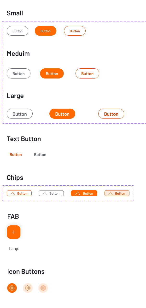
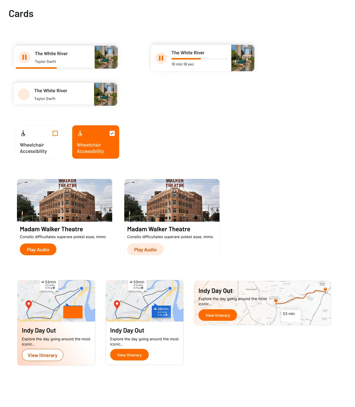
We created a scalable design system, including branding elements such as colors and typography, and guidelines for user interface components, including button states and cards.
BRANDING
With the product's vision being to make travel a personalized and educational experience, we brainstormed and came up with a plane-like logo to represent the travel spirit and landed on the product name as an ode to the travel experience.
COMPONENTS
PHASE 2
Our key areas for improvement:
Decrease time on task to generate an itinerary.
Decrease cognitive load compared to filters as users can use natural language to generate an itinerary.
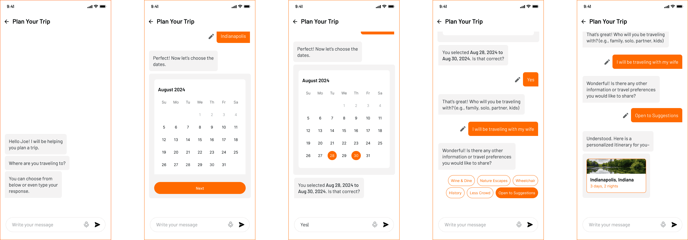
We landed on replacing the current flow with a Conversational AI agent. More on this feature coming soon as a case study!
PREV FLOW WITH ADVANCED FILTERS
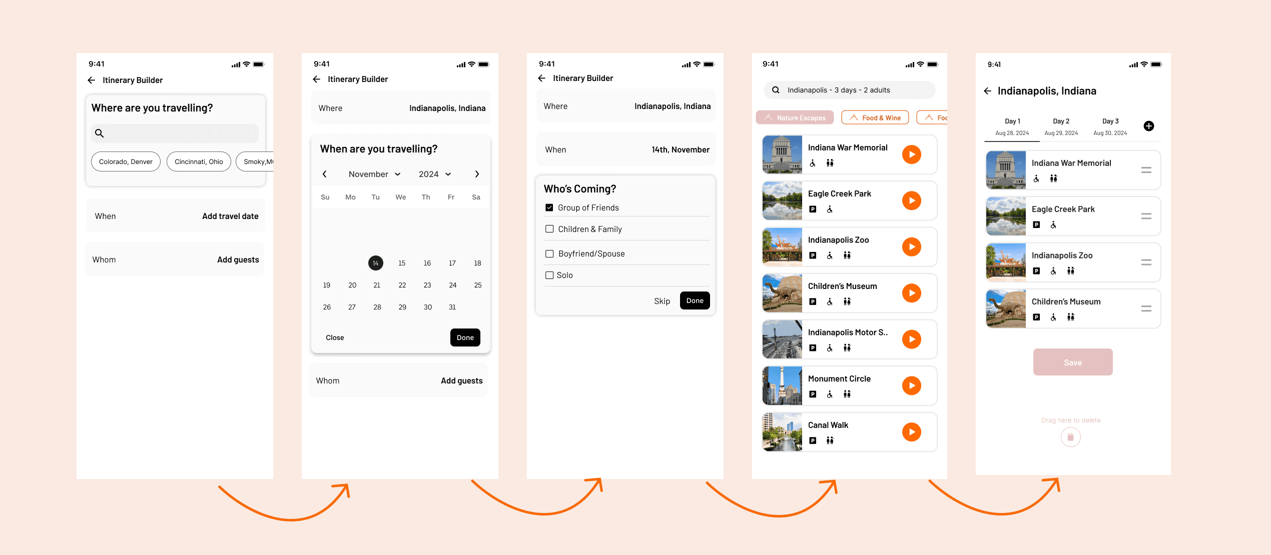
UPDATED LO-FI USER FLOW
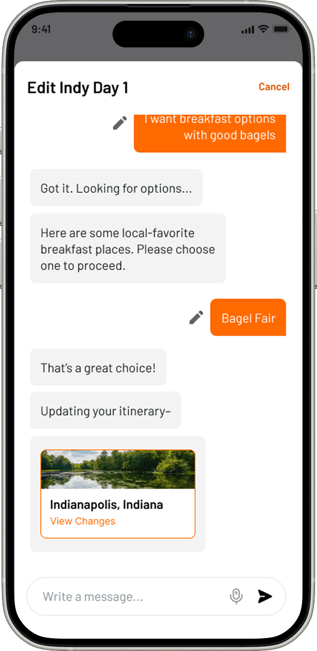
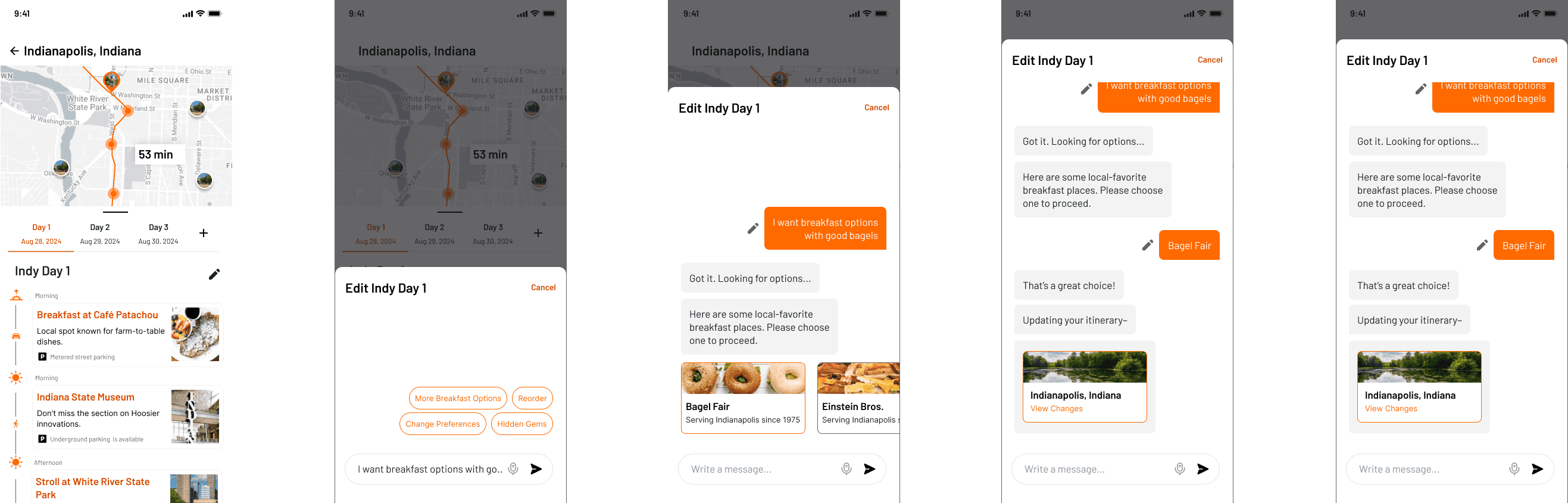
To make the first launch feasible, I designed the itinerary creation as a Conversational UI Chatbot.
UPDATED FLOW WITH CONVERSATIONAL AGENT
6/8 TESTERS EXPRESSED AN INTEREST TO EDIT THE ITINERARY
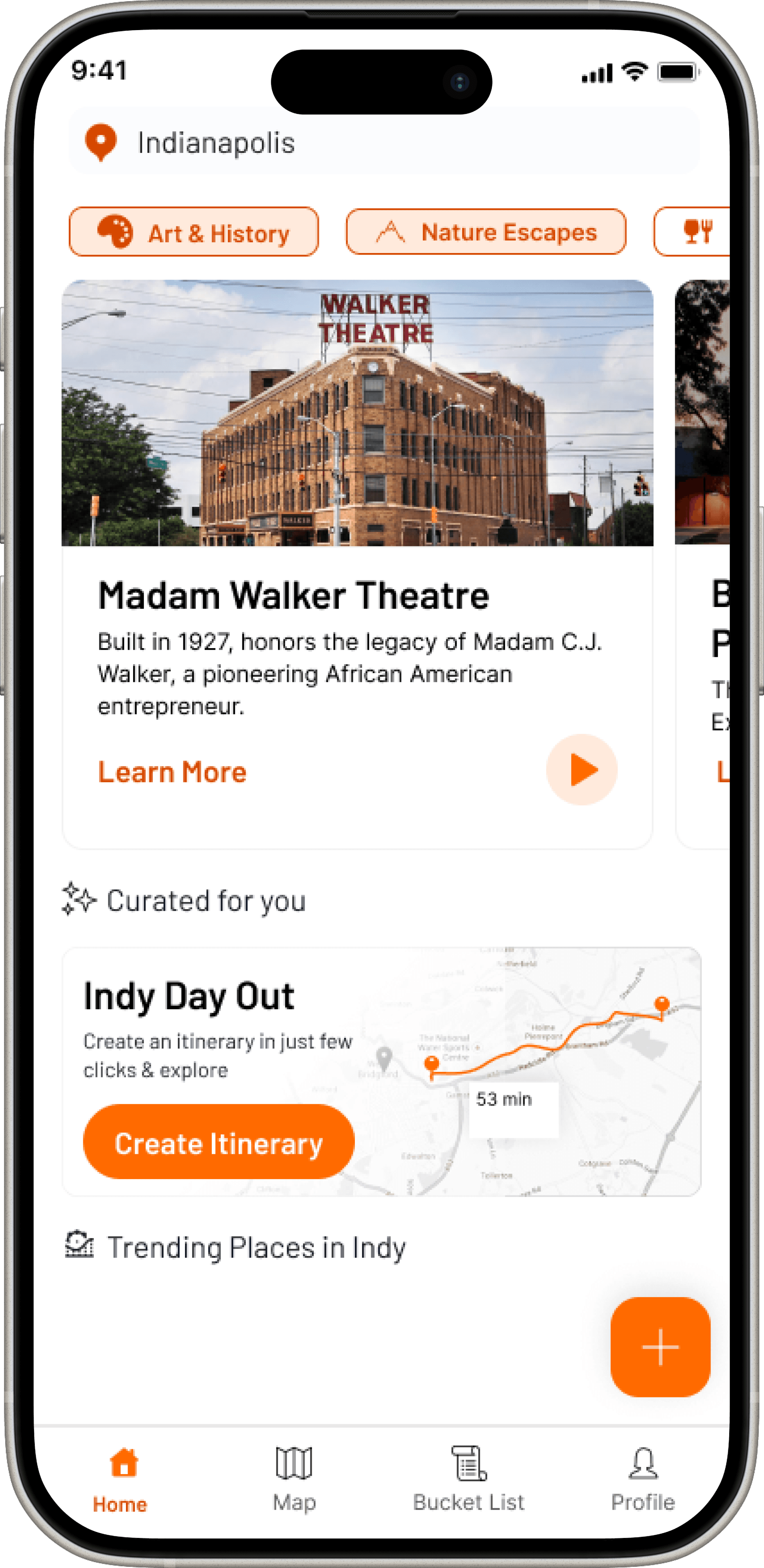
FINAL SOLUTION
Relaxed Planning
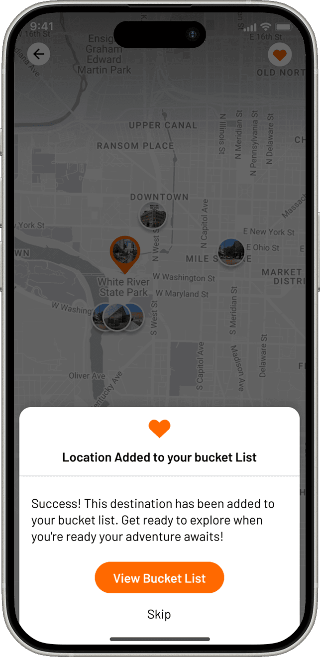
While browsing the app, users can add their favorite places by creating destinations in their "bucket list" for later reference when making an itinerary.
"On a Time crunch" Planning
The user can opt for Conversational AI and develop an itinerary based on their preferences and interests. These AI-based itineraries are sourced based on the app's database.
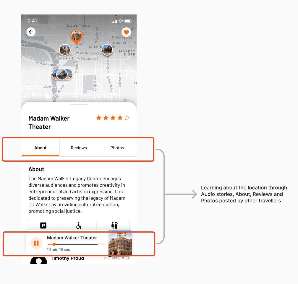
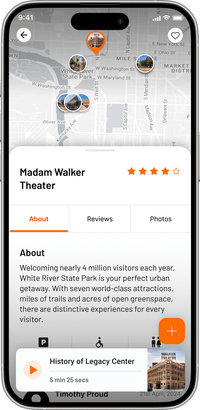
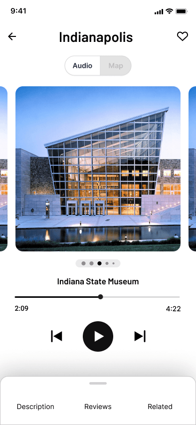
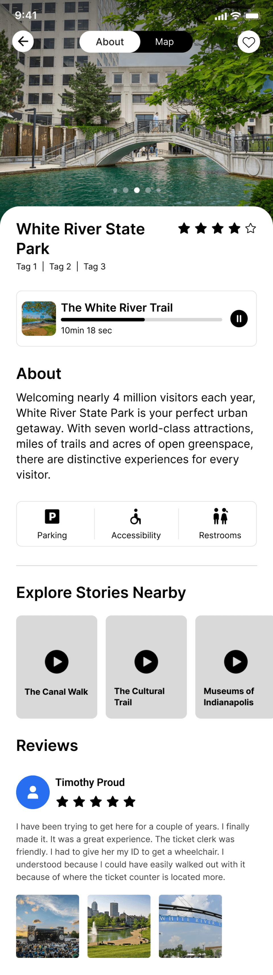
Education
The app offers mutliple ways of learning to the user about a location through Audio stories, About, Photos, Reviews from fellow users in the community.